Modern Kitchen Redesign
Human-Centric UX & AI-Powered Design
Introduction
This modern kitchen redesign project demonstrates how AI-powered tools were integrated into a human-centered UX process to explore design possibilities faster, visualize ideas clearly, and make informed decisions rooted in real user needs.
Project Overview
The objective of this project was to redesign an outdated kitchen and dining area into a functional, modern, and intuitive space. The focus was on improving workflow, storage accessibility, lighting, and overall usability while maintaining a contemporary aesthetic.
AI was introduced early in the process to support ideation, visualization, and validation, complementing traditional UX research methods.
Research
User Interview
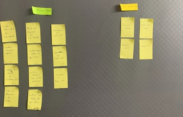
We conducted interviews, observations, and discussions to understand daily cooking habits, movement patterns, storage pain points, and emotional expectations from the space.


Research Insights
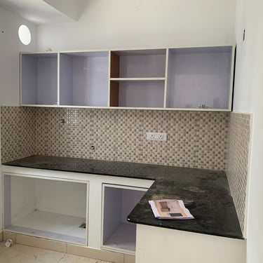
Congested Workflow
Issue: Limited counter space and inactive corner storage
Impact: Cluttered movement & physical strain
Opportunity: Activate corners + expand functional prep zones
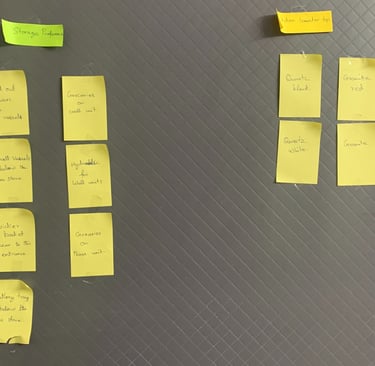
Persona

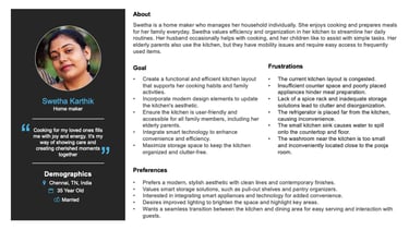
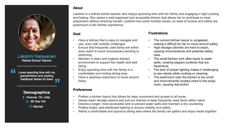
Personas were developed based on real user interviews and focus group discussions.
AI tools were used to structure, summarize, and validate patterns across qualitative data — helping identify consistent behaviors, motivations, and pain points without losing human nuance.
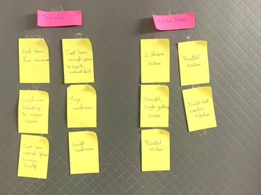
To validate storage zoning and item placement, a card sorting activity was conducted with users. Frequently used items such as spices, large vessels, appliances, and daily utensils were grouped based on natural recall patterns and usage frequency.
The results revealed a clear distinction between daily-access items and occasional-use storage, directly informing base cabinet reorganization, spice rack positioning, and corner unit activation.
AI tools were later used to cluster and visualize grouping patterns, helping accelerate synthesis while preserving user intent.
The prototype concepts were developed using AI-assisted design, guided by user research and an understanding of key user needs and pain points. These insights informed the layout and design decisions, ensuring each option focuses on functionality, usability, and efficient use of space.
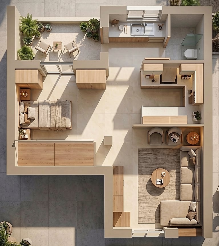
Option 1
The washroom was relocated from the center of the home to the backyard, removing a major obstruction and creating a more open circulation path. The new placement also allows for a slightly larger and more functional washroom while improving movement between the kitchen and dining areas.
The kitchen was shifted to the backyard and redesigned as a straight kitchen layout, supporting a smoother and more efficient workflow.
This arrangement also improves natural lighting and ventilation, allowing daylight to enter from both the left and rear sides of the home.
Option 2
The washroom was relocated from the center of the home to the backyard, removing the major obstruction and creating a more open circulation space between the kitchen and dining areas. The new placement also allows for a slightly larger and more functional washroom.
A U-shaped kitchen layout was introduced to improve workspace efficiency, while the sink was positioned separately near the washroom to optimize plumbing access and maintain a cleaner cooking zone.
This arrangement preserves the backyard area, allowing natural light and ventilation to flow more freely into the interior spaces.
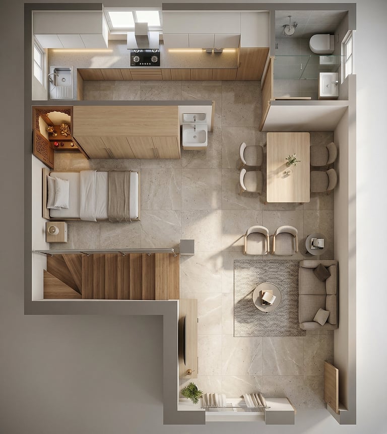
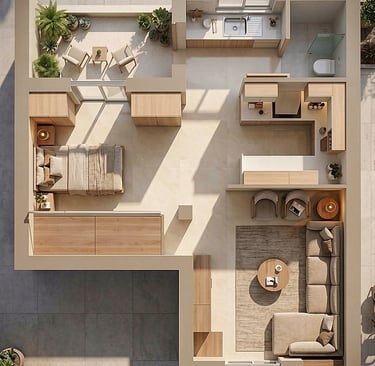
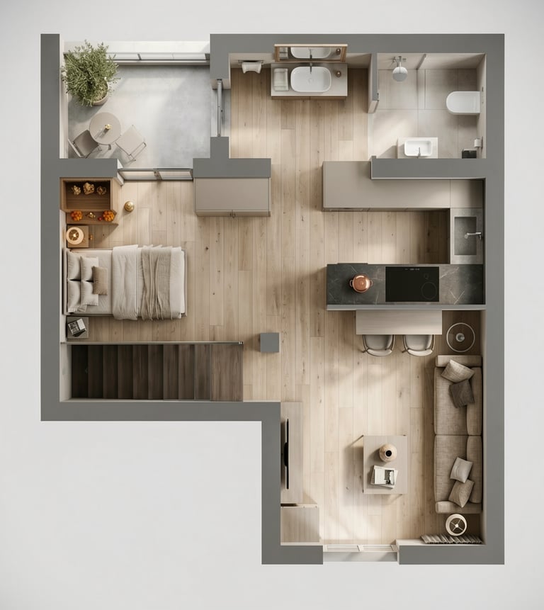
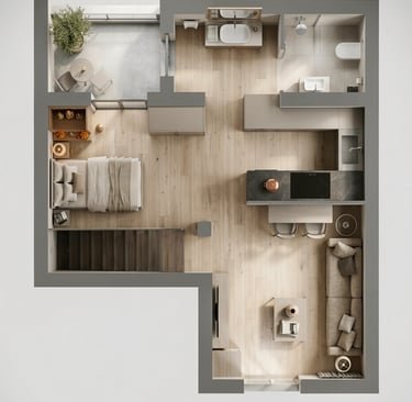
Option 3
The washroom was relocated from the center of the home to the backyard behind the kitchen, removing the obstruction and creating a more open circulation space between the kitchen and dining areas. This new placement also allows for a larger and more functional washroom.
A parallel kitchen layout was introduced to clearly separate the cooking and cleaning zones, helping maintain better organization and hygiene while providing sufficient space for comfortable movement during cooking.
This option also preserves the backyard area, allowing natural light and airflow to enter the home more effectively. An additional window was incorporated to further enhance daylight and ventilation.
During the user testing phase, participants were presented with the above three different kitchen layout options. Each option was evaluated based on criteria such as workflow efficiency, natural light, and overall user experience.
Option 1 involved relocating the washroom and implementing a straight kitchen design in the backyard. Option 2 retained the L-shaped kitchen layout but moved the sink near the washroom. Option 3 featured a parallel kitchen design, allowing natural light to flow in from the left and back sides.
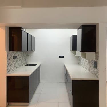
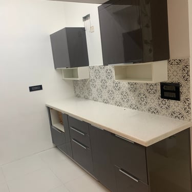
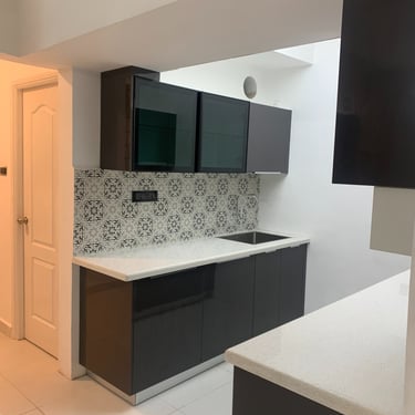
After thorough testing and feedback collection, the majority of users unanimously selected Option 3. They appreciated the seamless workflow and the enhanced natural light and ventilation provided by this design.
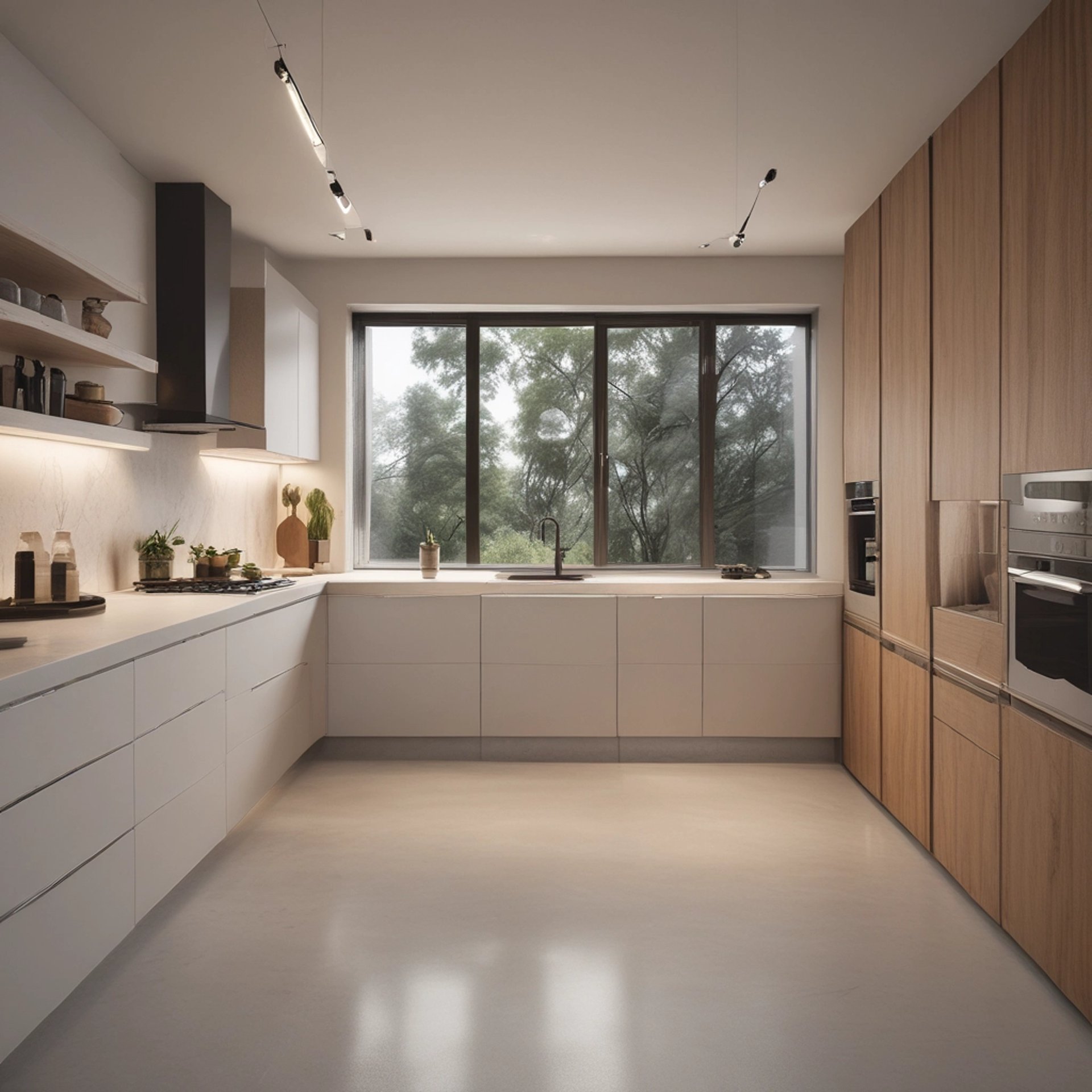
The kitchen and dining renovation successfully addressed the household's needs for functionality and aesthetics. By relocating the washroom to the backyard, we eliminated a major obstacle, enhancing the flow and usability of the space. The parallel kitchen design separated cooking and cleaning areas, ensuring cleanliness and ample movement space. Preserving the backyard allowed for natural light and ventilation, further improved by adding another window. This transformation resulted in a highly functional, visually appealing, and user-friendly kitchen and dining area that aligns with contemporary design standards and integrates smart technology for added convenience.
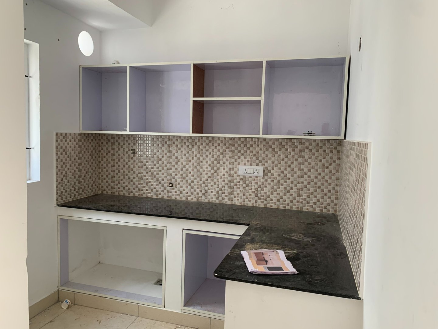
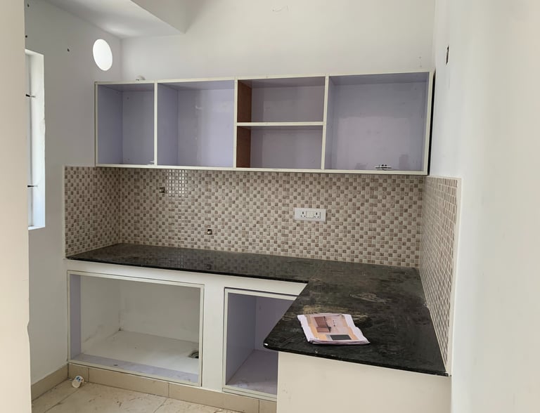
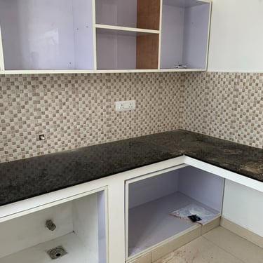
Before
After

Key Usability Insights at a Glance
Wet Zone Misalignment
Issue: Sink placed too close to cooking area
Impact: Constant moisture, hygiene concerns, water stains
Opportunity: Redefine wet & dry zones for safety and durability
Ergonomic Gaps
Issue: Electrical point placed in a corner near the stove
Impact: Difficult appliance usage for shorter user
Opportunity: Reposition outlets based on user height & task flow
Inefficient Storage Access
Issue: No spice rack; large vessels stored overhead
Impact: Repeated reaching & broken cooking rhythm
Opportunity: Introduce accessible daily-use storage at base level
Disrupted Work Triangle
Issue: Refrigerator placed far from main cooking zone
Impact: Excessive back-and-forth movement
Opportunity: Optimize layout using workflow principles
Spatial & Zoning Constraints
Issue: No dining space; compact washroom near pooja room
Impact: Reduced comfort & privacy
Opportunity: Reconfigure spatial zoning for balance and usability
Key Usability Insights at a Glance
Across observations and interviews, a clear pattern emerged: The kitchen was structurally built — but not behaviourally designed.
This research foundation directly informed the UX-led redesign and AI-assisted concept exploration, ensuring every design decision responded to validated user pain point